system Design
At times it is important to create a consistently similar design appearance that is applied across multiple pieces. These items work together to help reinforce the event or product they are promoting.



Advancement campaign
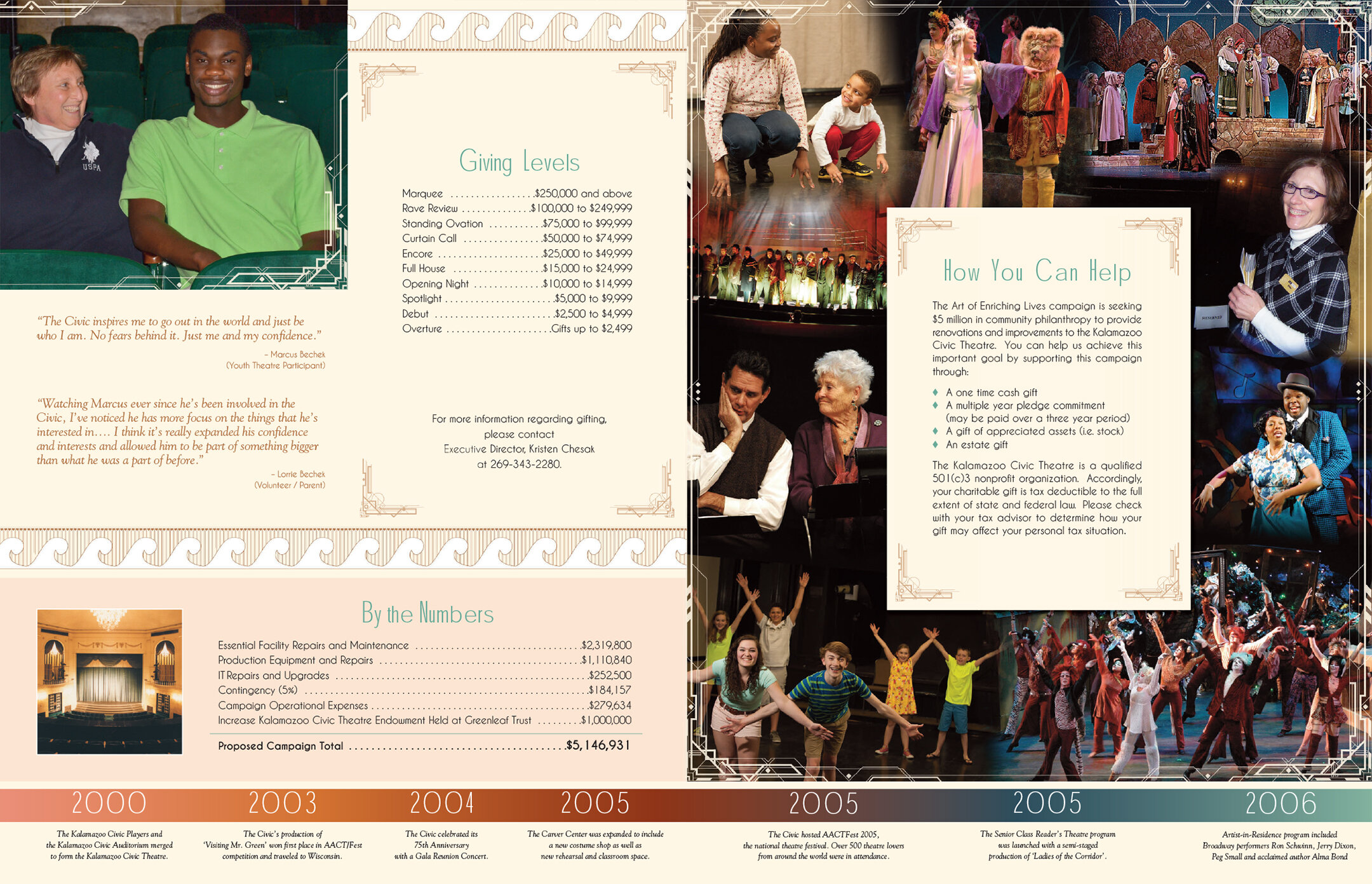
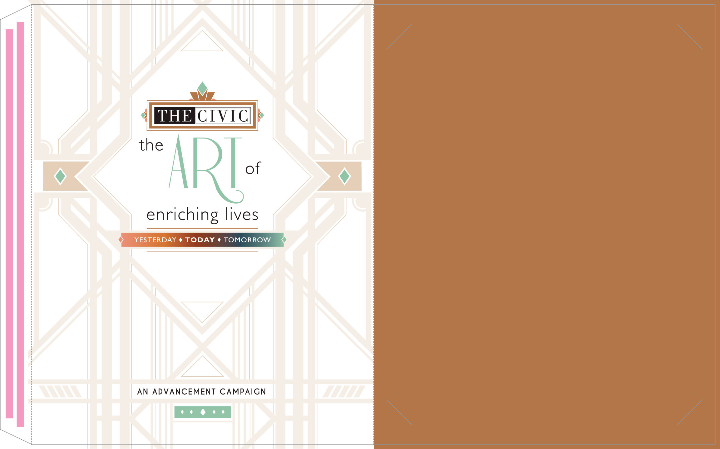
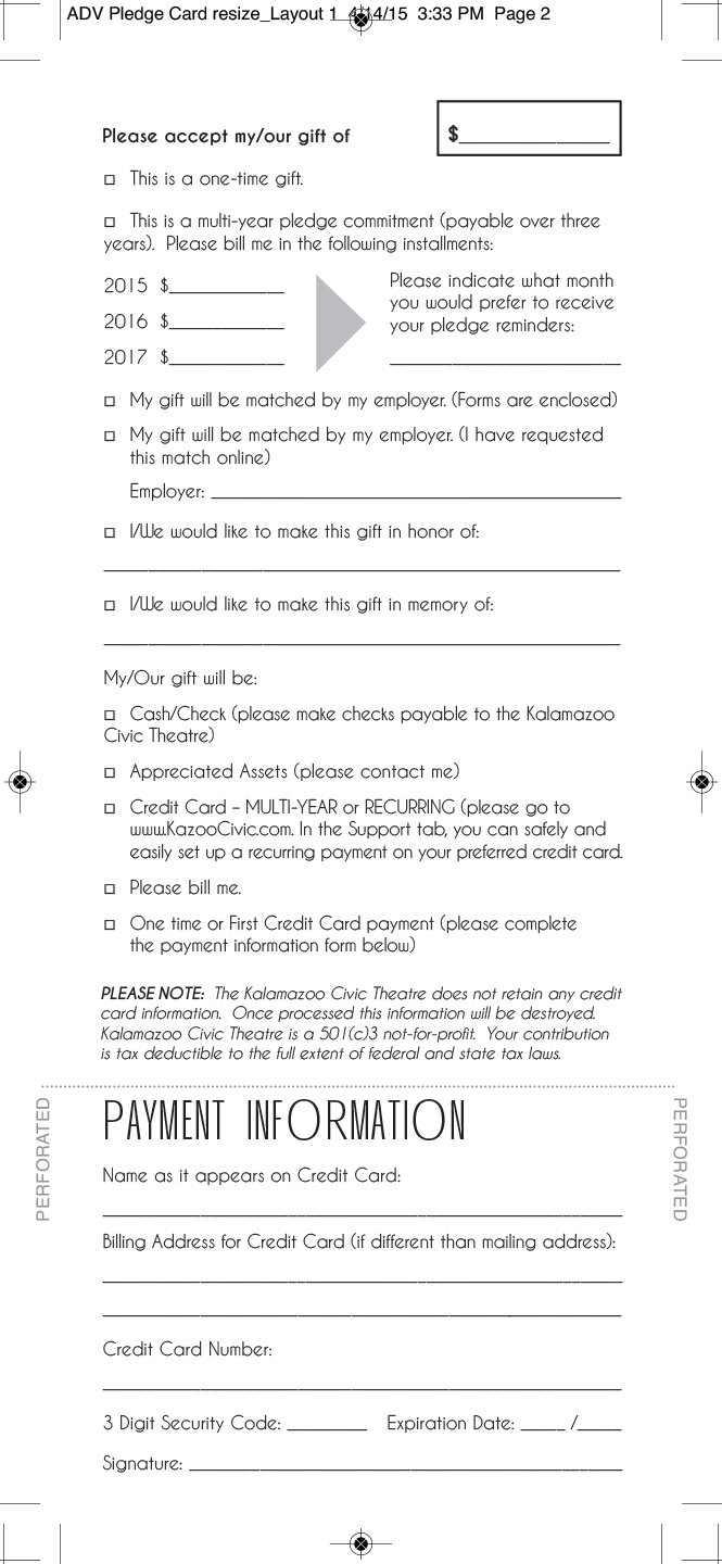
One of the largest system projects that I had the pleasure of being a part of. This was a massively successful campaign that exceeded the theatre’s goals raising over 5 million dollars in donations. These funds were used towards large scale facility maintenance projects including replacing the copper roof, re-plastering the auditorium, replacing the HVAC system, upgrading the sound system and technology, as well as, earmarking funds for new programs such as The Penguin Project to help the theatre become more accessible and inclusive. I designed all the print materials including the logo, folder, booklet, CD art, pledge card, thank you card, letterhead, note pad, signage, posters, progress pamphlet, lapel pin, bronze paperweight, billboards and ads.
The construction of the folder with its cutouts and pockets was the most complex parts of this system. I chose the paper stock and selected a metallic bronze ink that was added to the folder to give it an upscale appearance. The color palette I used had a duel purpose. It was used as a symbolic representation of the way copper changes colors over time when exposed to the elements. Copper is initially a shiny salmon pink color which shifts to a rusty red, then dulls and darkens to a blackish blue color eventually lightening to a greenish hue. The colors were also in keeping with the Art Deco period that the theatre was built during.
__________________________________________
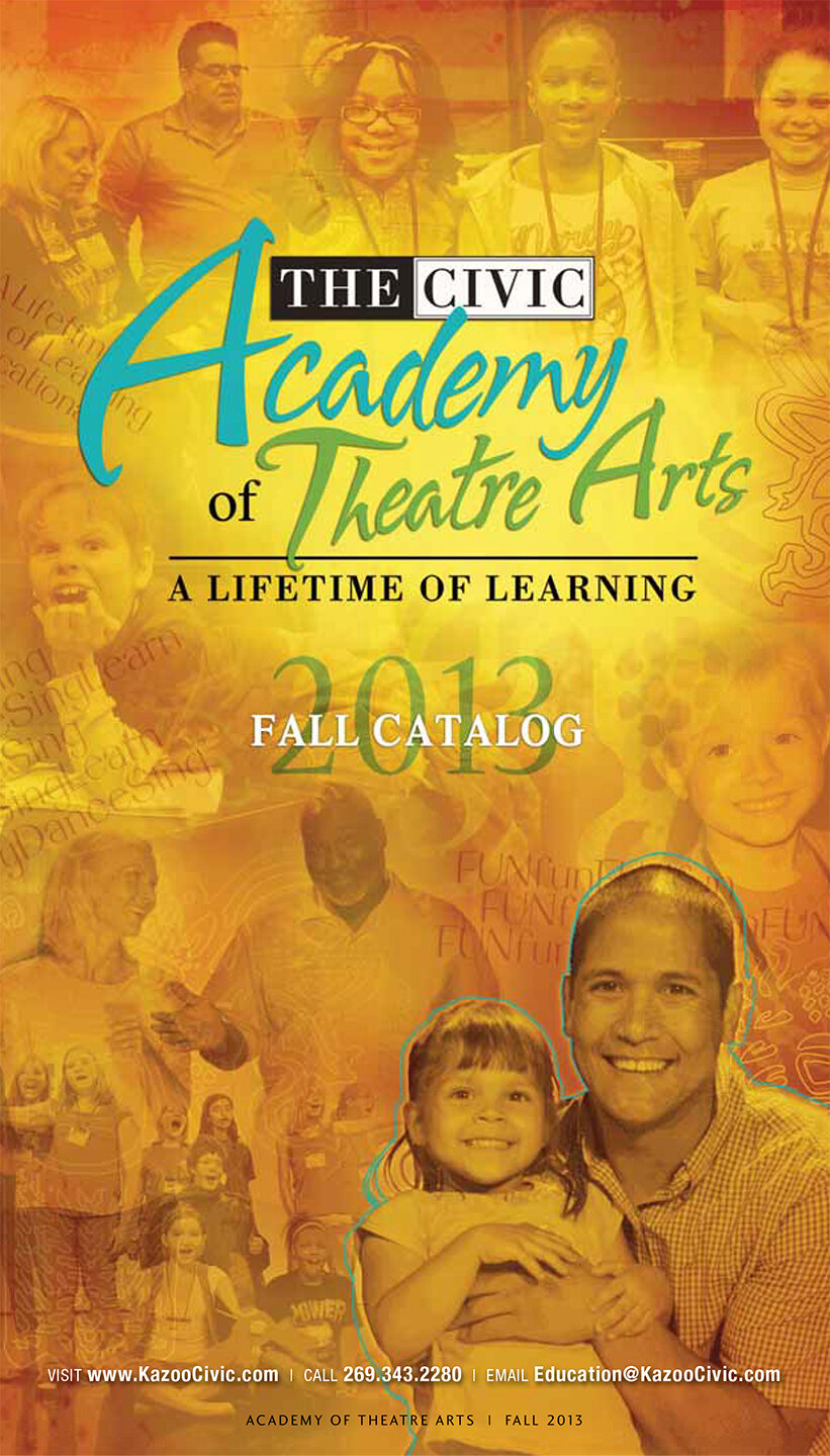

Academy of theatre arts
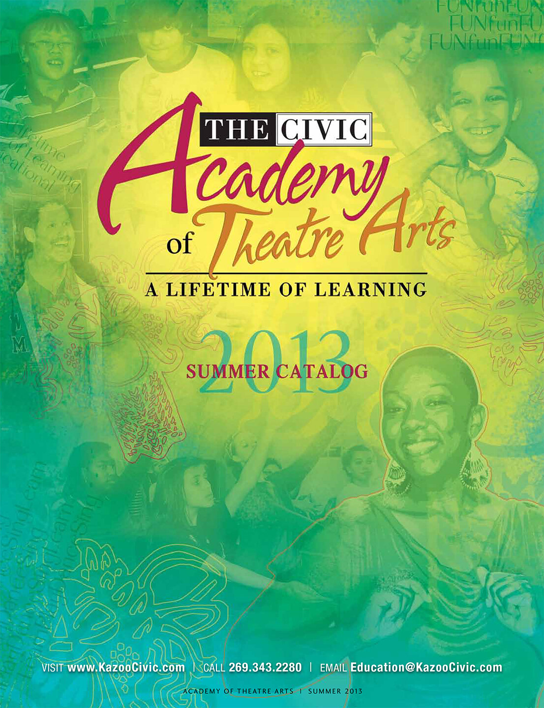
While at the the Kalamazoo Civic Theatre I often created multiple design pieces that needed to hang together as a set. The education catalogs were one of the many systems that I would create each year. The new season would kick off with the Summer catalog which was the largest of the three catalogs. The Fall and Winter catalogs were about half the size due to the smaller amount of classes offered during those sessions.
__________________________________________

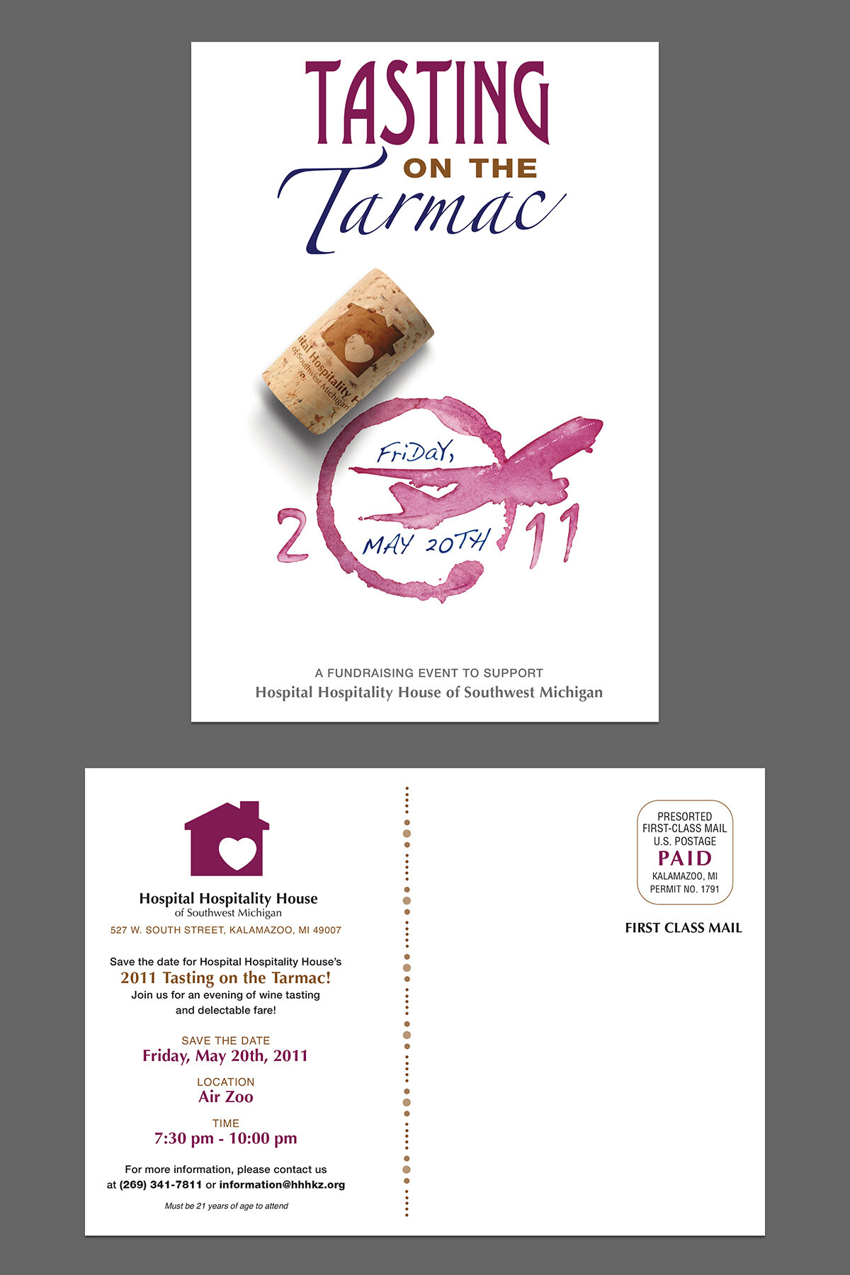
HOSPITAL HOSPITALITY HOUSE
Pictured above are materials used to advertise the wine tasting fundraiser for Hospital Hospitality House. I was hired to design a poster, postcard and email blast for this event.
__________________________________________


